
That’s all the time your pitch deck gets before investors move on.
A Dropbox DocSend study analysed 200+ startup decks. The findings?
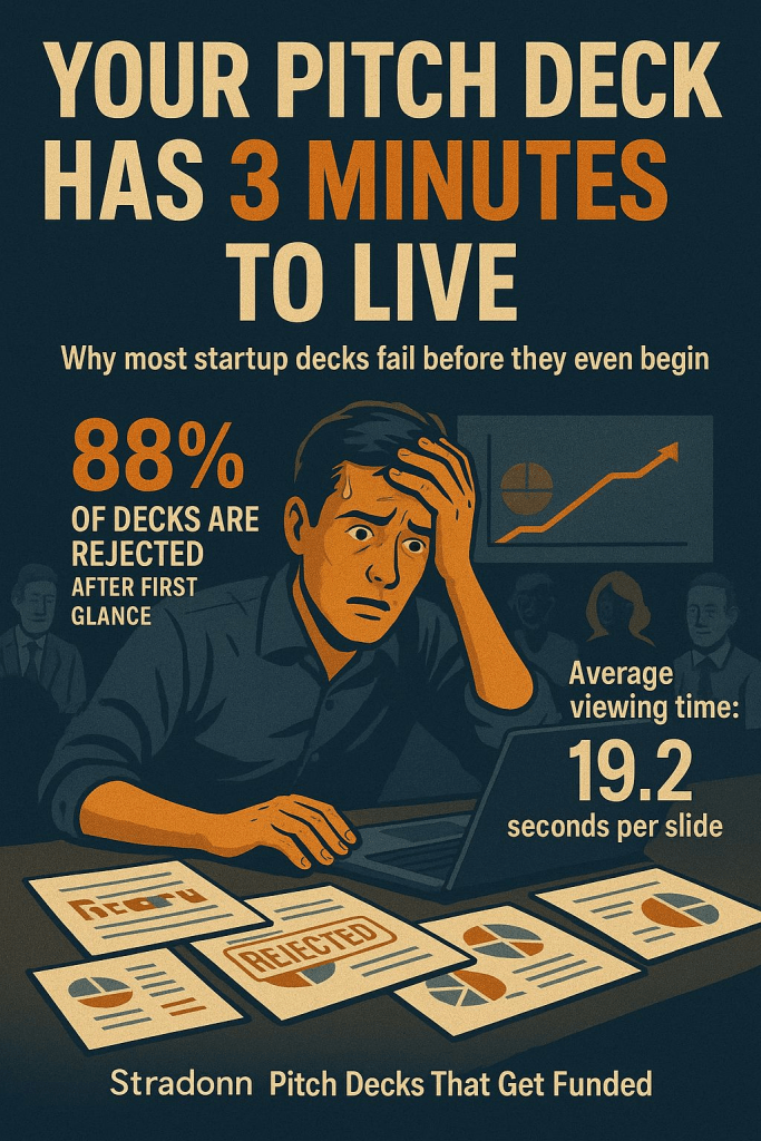
- Only 12% were read in full
- Average time spent per slide: 19.2 seconds
- Most time spent on: Company Purpose, Business Model, and Financials
Founders Obsess Over Storytelling.
But Investors Are Scanning for Clarity, Traction, and Proof.
Here’s what 80% of VCs look for—and how to make every second count.
1. Nail Your One-Liner
- The most viewed slide is your Company Purpose.
- Yet most founders get it wrong—either too vague or too long.
- You need a sharp, specific sentence.
Example:
“We help SMBs cut logistics costs by 30% using AI-based routing.”
One line. Clear ROI. Zero guesswork.
2. Competition Slides Shouldn’t Need Explaining
- VCs spent 51% more time on the Competition slide in successful decks.
- What works: a quadrant chart or a simple table.
- What doesn’t: dense text or a “we have no competitors” claim.
- If they can’t quickly see why you win, you don’t.
3. The Financials Slide Isn’t Optional
- Funded decks? 100% had one.
- Non-funded? Only 58% did.
VCs expect:
- CAC vs LTV
- Burn and runway
- Revenue forecast (top-down and bottom-up)
Don’t bury the metrics. Highlight what matters most.
4. Visuals = Trust
- Clarity drives confidence.
- Inconsistent fonts or cluttered charts? It’s a red flag.
- Great decks have whitespace, data hierarchy, and brand alignment.
- Design doesn’t just make it look better.
- It makes it believable.
5. Traction Wins Attention
In one case, a founder raised $10M with a single graph showing 12 months of user growth.
That traction slide?
- Held attention longer than any other.
- Charts > paragraphs
- Progress > promises
6. Turn Your Product into a Story
According to VCs, they’re 20x more likely to remember a pitch with a customer success narrative.
Frame your slides around:
- A real-world problem
- A clear before/after
- A user who benefited
Features tell. Stories sell.
7. TAM/SAM/SOM Done Right = Follow-Up
- Big numbers don’t impress. Credible breakdowns do.
- Decks that mapped out the market got 2x the meetings.
- No fluff. Just logic, visuals, and citations.
- Make the market feel big and believable.
8. There’s a Structure That Just Works
The top decks follow this 10-slide flow:
- Purpose
- Problem
- Solution
- Why Now
- Product
- Market
- Business Model
- Traction
- Team
- Financials
It’s not just a format—it’s psychology.
Every slide answers an investor’s next question.
At Stradonn Consulting, We Don’t Just Design Decks. We Craft Investor Magnets.
We help founders:
- Build narratives that flow
- Turn spreadsheets into dashboards
- Visualize traction with clarity
- Create financials that build trust
Pitch decks, board reports, dashboards—if it’s investor-facing, we elevate it. Contact Us here or Fill the form below to get started:


Leave a comment